The best and the worst, 2022 World Cup Kits ranked.
A bracket style ranking of the 2022 Qatar World Cup Kid for every team.
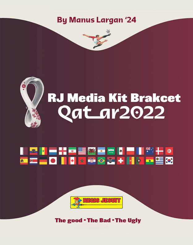
Kits are an important part of football culture. Kits can either go down in history, for good, or bad. We even see today, kits from the 90’s are becoming as iconic as the teams and players of that era. Modern day kit manufactures have this in mind, and are hoping to create kits that will be as Iconic in 10 years as they are today. With the world cup now less than a week away, we will be running a whole tournament of kits. The kits selected are personal opinion of each team’s best kit, whether it be Home, Away, or even a pre match top. Let’s see which kits will become iconic, and which are doomed to the clearance rack.
GROUP A
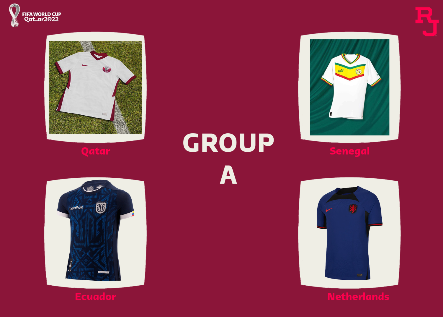
1st Place: Senegal! A lovely kit. Puma have created bespoke kits for every team. And have quite a few African nations. I love the use of the flag on this home kit. It looks simple, yet brings something exciting. Better than the others, but it doesn’t beat Qatar by much.
2nd Place: A template heavily used in the Euros, but it looks lovely in this colorway. The white is more off white, and complemented by the maroon we are seeing all across this tournament, it’s a lovely kit. The badge is also a very cool design, but I’m not sure if you would want to be walking around in a kit representing everything that Qatar represents, but on the design side, it’s a beauty.
3rd. Ecuador: I think this one is nice, but not anything special. It seems like it would be quite hard to pull off, but I do like the few colours used.
4th. Netherlands. This could have been so much better. They’ve used the Nike template, and unlike other teams, it’s a clear template. If you take the badge off, it’s a normal kit. Nike could have done so much more. Even the home kit is poorly made. They have the iconic orange, and that has so much potential. Very big miss.
GROUP B
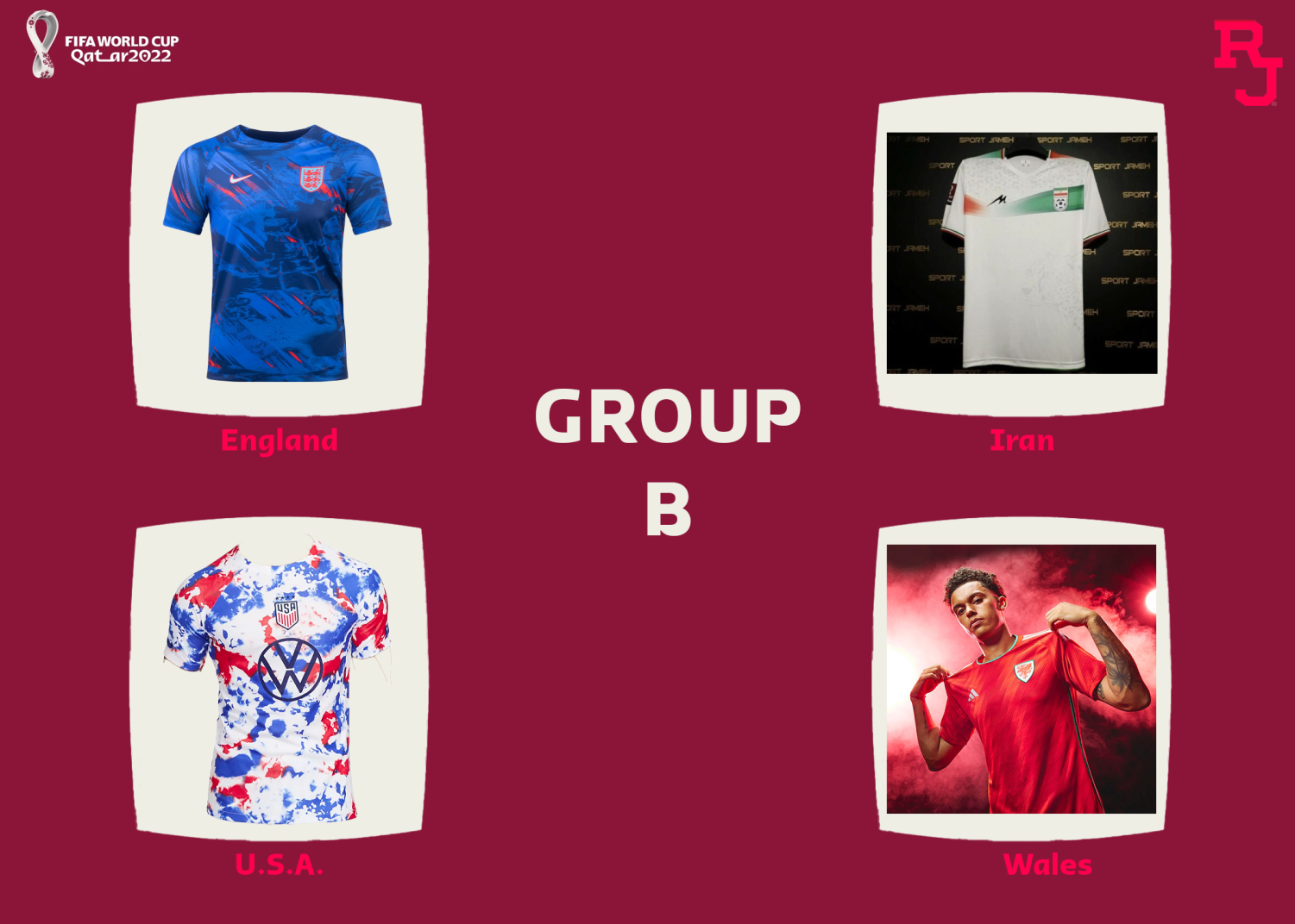
1st. U.S.A. This one is lovely. This prematch effort is miles better than the home or away. If they used this as a main kit, they would sell loads more. The tie-dye isn’t for everyone, and I think this is definitely aimed at the younger generation, but that matches the age range of this team. It’s just a shame that the team won’t get nearly as far as the kit.
2nd. Another lovely pre match shirt, England. I think it’s clean, and a great alternative to the somewhat bland home and away. Not as bold as the US, and not as good as the 2018 warm up shirt. Definitely one to buy, and hopefully one that sees the same success England are hoping to achieve in the tournament.
3rd. Wales. Not too much to say here. A nice effort, but it won’t rival the lovely warm ups. I like the use of the green stripes on the shoulder, but other than that a bland kit.
4th. Iran. A kit ranking similar to what they look to finish on the pitch. A weak effort, and nothing exciting at all.
GROUP C
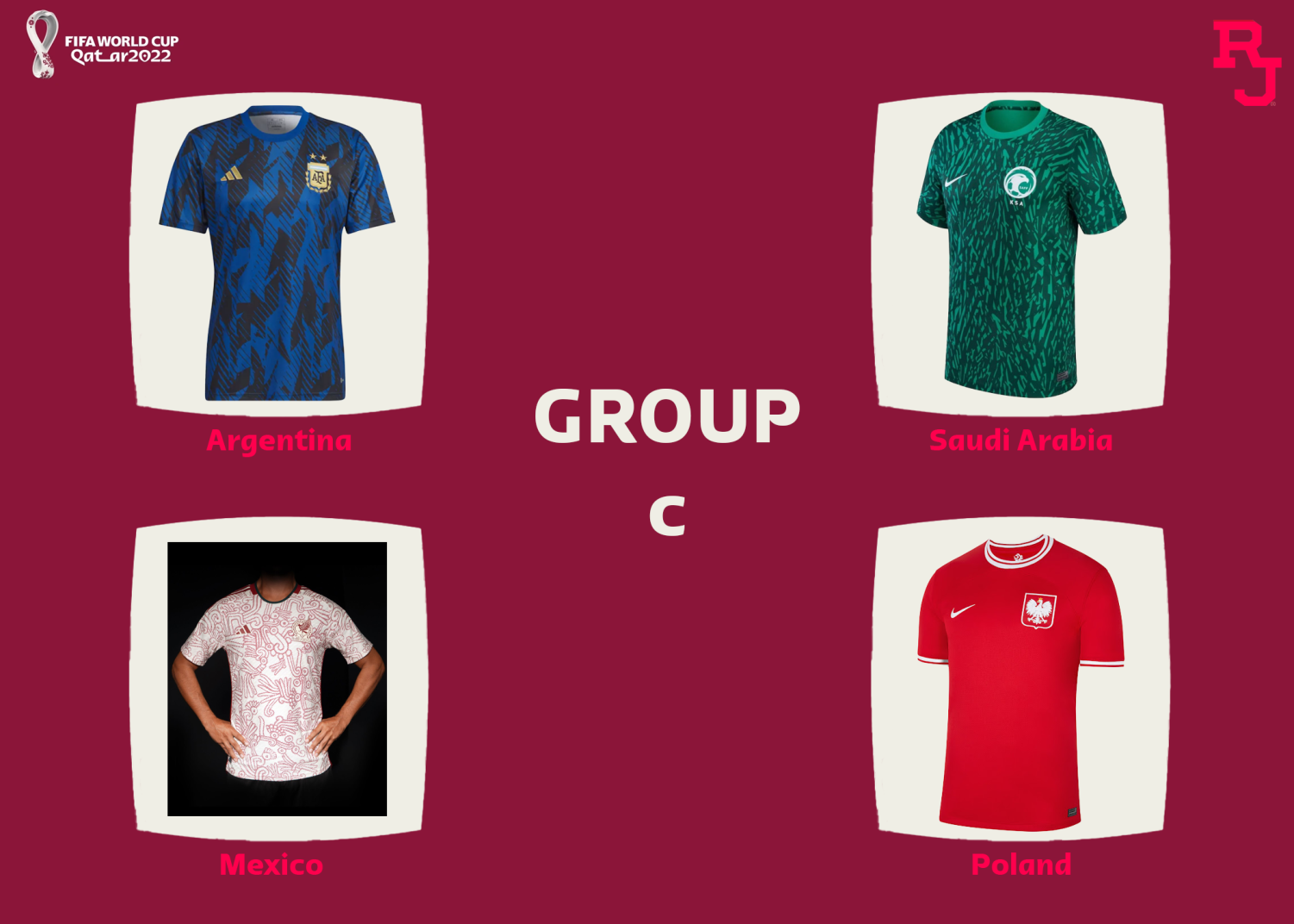
1st. Mexico. This one might seem meh from first looks, but look at the details, and how it relates to the history of the country, and it is a lovely kit. I think they’ve got a very nice crest, and while the graphics are prominent, they aren’t overwhelming. A strong title contender here.
2nd. Another warm up top, and another Nike warm up top. A top contender, Saudi Arabia’s pre match number. The detailing, along with the deep green really make this kit a great one. If this was in almost any other group, I think it would be top, but as it is, it finishes second.
3rd. Argentina. Another great contender, but the other kits in this group outdo this warm up. I do really like the fire design, but I don’t see how the flames relate to Argentina, although you could say after this group stage, Argentina’s Kit World Cup hopes are going up in flames.
4th. An uninspired Poland number. Plain, red, nothing special. A kit not worthy of a world cup run, and their Kit World Cup run ends here.
GROUP D
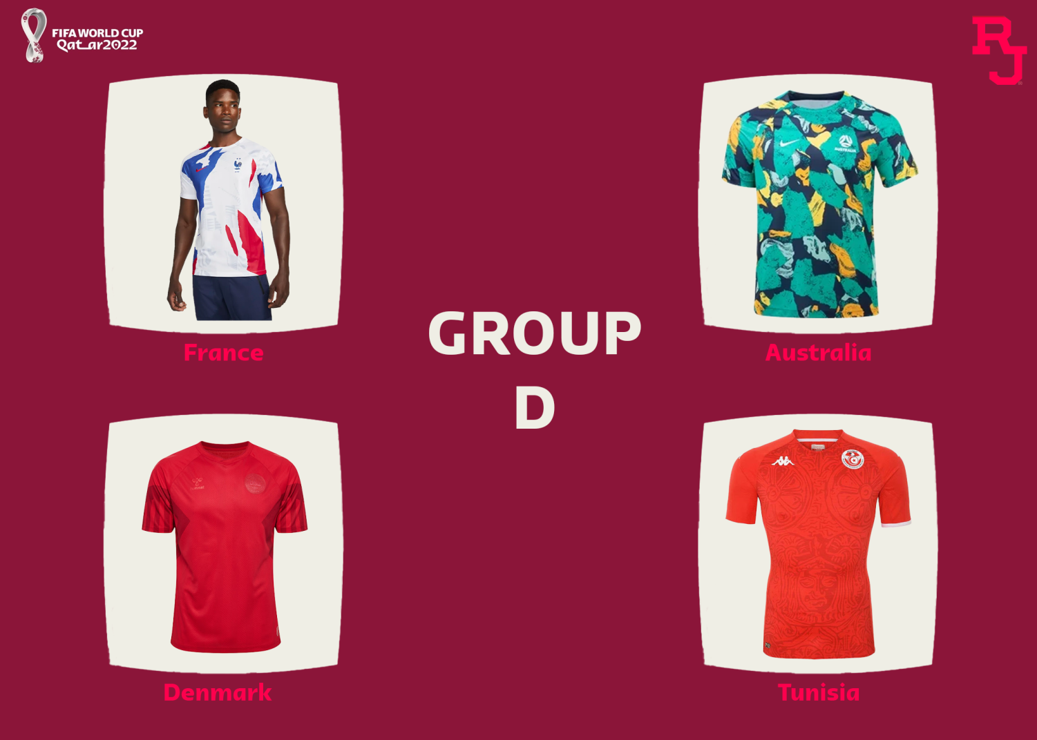
1st. Australia. A design worthy of a team with the nickname “Socceroos” An interesting design risk, but one that has paid off. Australia don’t have an amazing crest, but it’s barely visible with this kit. The use of the colours really brings this kit out. It’s a shame Nike made such an effort with the pre-match jerseys, as they are the ones we’ll see least.
2nd. France. Nike, come on! Give other teams a chance! Another very very nice warm up. The colours are nice, the design is interesting, but overall it’s a nice kit. I think it would also be really really nice as a longsleeved version.
3rd. Denmark. I like this kit, purely due to the message all three of the Denmark kits present, but I think for design purposes, it isn’t a world cup winning kit. Although, if Regis picked this design up for the new kits, I wouldn’t complain…
4th. Tunisia. A country like Tunisia will never have the elite kit manufactures like Nike or Adidas, but Kappa is a strong contender. A con with most kappa kits is the fit. Skin tight. Great for elite footballers, but for fans sitting on the sofa at home, it’s not ideal. The design here is nice, but not something to beat any of the other strong contenders in this group.
GROUP E

1st. Japan. This kit seems underwhelming at first, but take a closer look at the sleeves, and you’ll find a lovely, iconic, Japanese design. The design of the origami on the sleeves would be overwhelming all over, hence the reason we didn’t choose the home. But as a subtle detail, it is absolutely lovely. An extremely strong contender, in a group full of competition.
2nd. Germany. This one was tough. Spain have a great design, but the German Pre match shirt takes second in this group. The use of the iconic German colours really helps this kit, along with the black/grey base. Still, a shame this is only a warm up, but a very very good pick for going far.
3rd. This one went back and forth with the German top, but the Spanish Pre-Match number unfortunately misses out. The design, inspired by the iconic 2010 Jubulani ball, is nice, but it isn’t necessarily screaming spain.
4th. Costa Rica. It’s just plain. Could be a contender in a different group, but it seems miles off the others in the group.
GROUP F

1st. Belgium. Adidas use the flames once again, but with these colours, it looks far from Tacky. The red base with the black sleeves would be nice in itself, but with the flames, it is next level. Belgium’s away is also very nice, but I picked this one purely because white is easier to stain.
2nd. Morocco. Puma at it again, a lovely simple kit. The use of the design isn’t too much, but also isn’t too little. The green accents, along with the green Puma logo, make this a really nice kit.
3rd. Croatia. They have so much potential, but they are also so limited. They have to keep the checks, but it seems this year, they ran out of ink. The placement/lack of placement of the checks makes no sense, and won’t see it out of the group stage.
4th. I almost feel bad for Canada. The only nation not to receive a new kit for the World Cup, and even more, the kit was originally teamwear with a canada badge slapped on. 4th for obvious reasons, and I expect this will be the last kit Nike make for Canada.
GROUP G
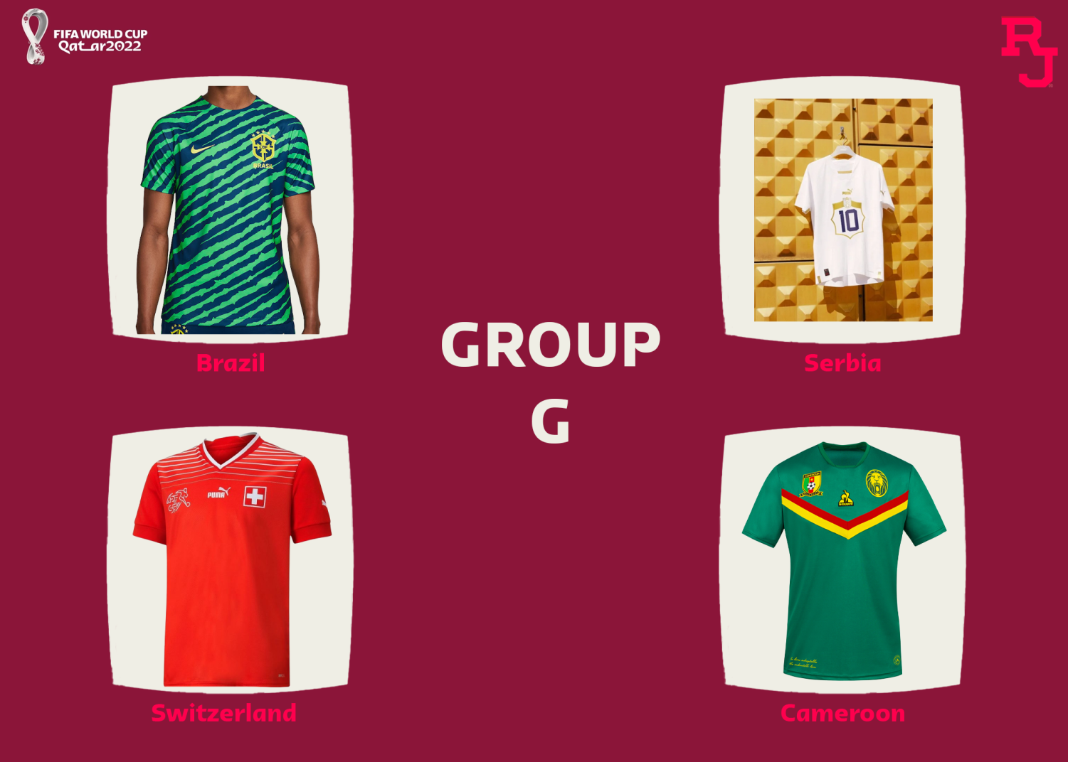
1st. Brazil. This group could be the best, it has some great efforts, but this one screams Brazil. The pattern is loud, it’s all over, and innovative, much like the team itself. Bold, but bold in a good way. It would be hard to pull this off, but if you’re Neymar, it’s easy to look stylish in anything.
2nd. Serbia. It’s plain, but again, a good plain shirt. Using puma’s interesting number plate thing, it seems like a shirt you can wear to an event without being the main event. Almost the opposite of the Brazil shirt. I do think, for all of these puma templates, with no number on the front, it seems like it is missing something.
3rd. Cameroon. It is nice, but it isn’t the other 2. The use of the colours of the flag is nice, but the kit maker’s logo in the middle takes some of the swag away. 3rd place.
4th. Switzerland. Again, it seems like the plain kits aren’t doing it this year. This one has lines at the top, but that’s where they stop. Potential to be nice, but it doesn’t seem to be reaching it.
GROUP H
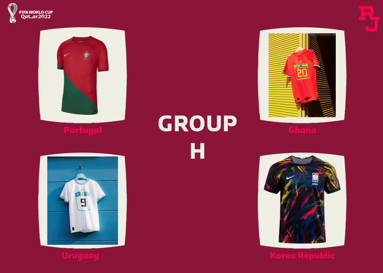
1st. Uruguay. The baby blue is nice, and finishes off another very nice puma template. In another group with some great contenders, this one scrapes by, and wins the group.
2nd. Ghana. The redness here is unique, and the use of the yellow, green, and orange makes this kit special. I think for me, it would be hard to pull off, but among the rest, it’s better than 2 others, but not by much.
3rd. Korea. Wow, this one was tough. I really like this design, but I just think wearability isn’t there. This feels hard to style, and unfortunately just misses out on making the knockouts.
4th. Portugal couldn’t pick one colour to use as the base, so the pickles 2. I don’t fully understand the placement, and why the green is on bottom, or red on top. This one just feels sloppy, and last minute.
THE KNOCKOUT STAGES.
I’ve said something on every kit, so for the knockouts, I am going to try to stick to one sentence on why the winner won.
ROUND OF 16
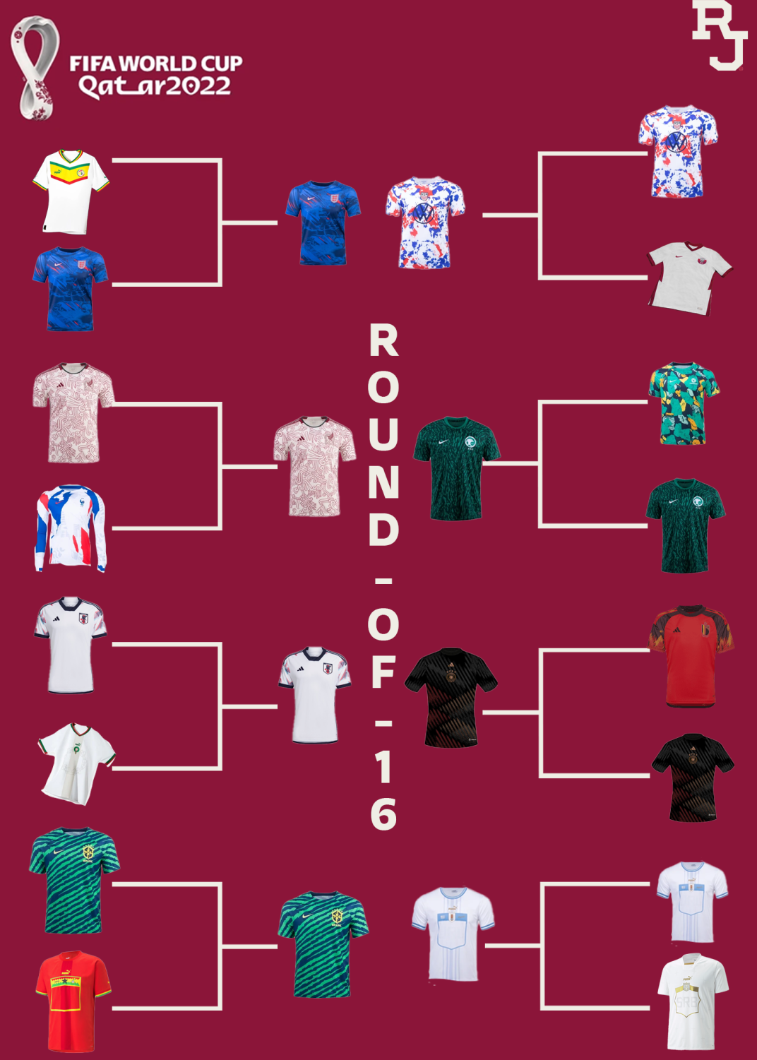
Senegal Vs England: England. Bolder, braver, better.
Qatar Vs USA: USA. Louder, aimed at the younger fans, spreads a better message than Qatar.
Mexico Vs. France. Mexico. A tough fight, but Mexico takes this one, better designs, more historic.
Australia Vs. Saudi Arabia: Saudi Arabia. Narrowly wins this one, I think this one is a little more discrete.
Japan Vs. Morocco. Japan. Has better designs, and isn’t so plain.
Belgium vs Germany. Germany. Looks so nice, and the rareness of a black kit in this tournament brings this to a new level.
Brazil Vs. Ghana: Brazil. Ghana make a good effort, but beating this Brazil top will be hard.
Uruguay vs. Serbia: Uruguay, for the sole reason of the colours, I think the baby blue is better than the gold.
QUARTERFINALS!!
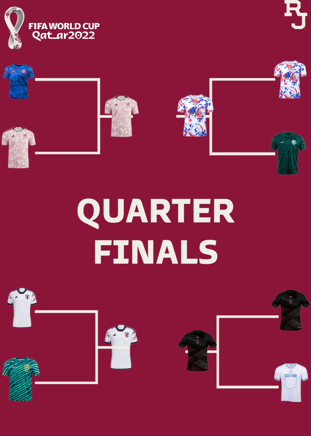
England Vs. Mexico: Mexico. As much as I love this England number, I think it will be hard to knock this Mexico away strip out.
USA vs Saudi Arabia: USA: I think it is more bold, and adds something very rarely seen.
Brazil Vs. Japan: Japan. This matchup was a great one. These kits both could make a very strong run, but ultimately, Japan has the historic element.
Germany Vs. Uruguay: Germany. Has more going on, also harder to stain.
SEMIFINALS
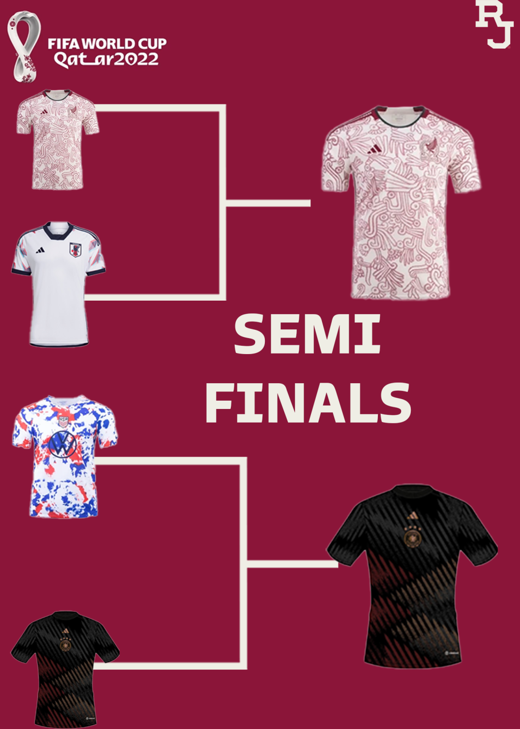
Mexico Vs. Japan: Mexico. Both of these Adidas kits have had great runs, but in the end, Mexico is more eye-catching.
USA Vs. Germany: Germany. Another Epic showdown, but Germany takes this one. The US one is great for the younger generation, but this Germany warm-up is great for everything.
THE FINAL.
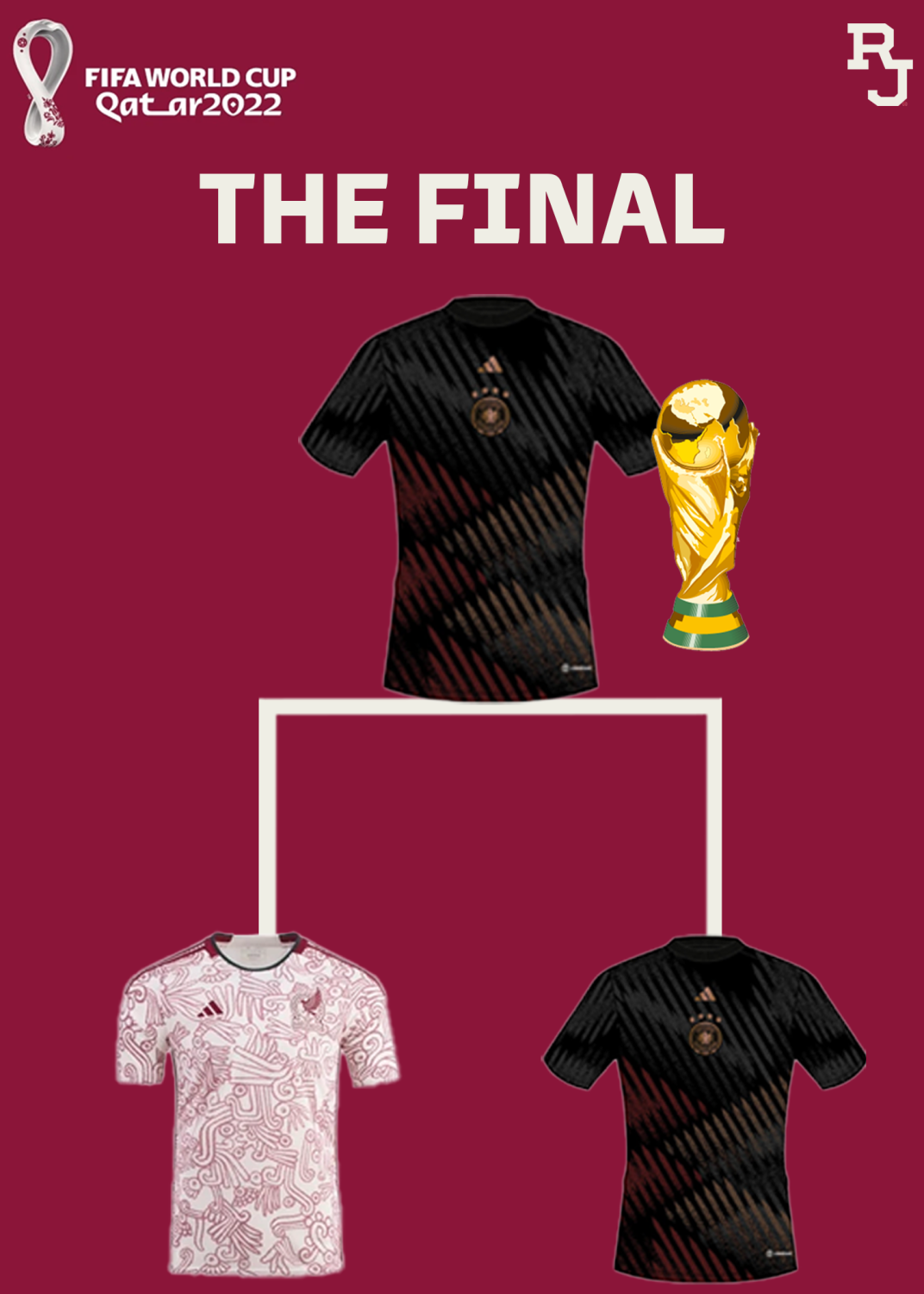
Wow, what a final. Two phenomenal Adidas numbers. Two history filled kits. A showdown for the ages, a proper world cup final. In the end, Germany win. The simplicity makes this one I can easily see being worn over a hoodie, or during any season. Feels like this will stand the test of time, and we could be seeing this for years.
Will the Kits go as far as the teams? Further? Do you agree? Disagree? Let us know!